Monday, February 2, 2015


Thursday, November 13, 2014
Tuesday, June 24, 2014
Wednesday, May 28, 2014
Tuesday, April 22, 2014
Thursday, April 10, 2014
Monday, January 20, 2014
Thursday, December 26, 2013
Tuesday, September 24, 2013
An Easy Halftone (Newsprint) Photo Effect
Learn how to apply a halftone, newsprint effect to a photo in just a few quick, easy steps using GIMP.
Thursday, June 13, 2013
Quick and Easy Pencil Sketches
In this short project you will learn how to use GIMP to quickly and easily get a pencil sketch effect.

Note that the settings used in this tutorial work for the image I used. They can vary widely to achieve desired results for different source images. If you would like to download the picture I used in this tutorial, click here.
Open the image that you want to modify. Duplicate the image layer, Layer - Duplicate Layer.

Desaturate the duplicate layer, Colors - Desaturate..., Choose shade of gray based on: Lightness in the dialog.

Now, use the Edge-Detect filter on the duplicate layer to get the basis of the sketch effect, Filters - Edge-Detect - Edge..., select the Roberts Algorithm from the drop down menu, set the Amount to 5.

Invert the colors on the duplicate layer, Colors - Invert.

Reduce the Opacity using the controls in the Layers pallet. I turned it down to 50%.

To get a black-and-white sketch quickly, the process is almost identical.

However, after you duplicate the image layer, go to the Colors menu and select Desaturate..., Choose shade of gray based on: Luminosity. Duplicate the desaturated layer and continue as above.
Filters - Edge-Detect - Edge...
Algorithm (Roberts) - Amount (5)
Colors - Invert
Reduce Opacity (75%)

This text tutorial is based on a YouTube video tutorial by Techtonicc.
Saturday, February 2, 2013
Building a Spy Movie Banner
In this GIMP project, you will learn the basics of creating a movie banner in a style that might be used for a spy movie. You will use layer blending modes, text layers, and color manipulations, as well as other skills.
Source images you can download or use your own similar images:
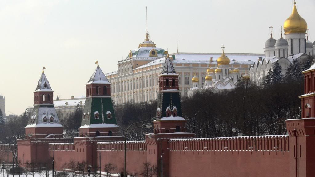
Kremlin (Original photo by Yaroslav Ushakov)
Man in Suit (Original photo by Rubén B. Todos)
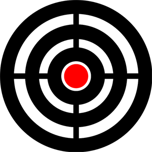
Bull’s Eye

- Part 1. The Kremlin
Apply a dark, monochromatic red, slightly blurry effect to the Kremlin image.
Open the Kremlin source image. Convert it to grayscale, Colors -Desaturate..., Choose Shade of gray based on: Luminosity.
Duplicate the layer, Layer - Duplicate Layer. Set the blending Mode of the copy layer to Multiply and slide the opacity down to 70%.
Merge these layers into one, Layer - Merge Down. Name the new layer, Kremlin.
Apply a slight Gaussian blur with a radius of 5 for both Horizontal and Vertical, Filters - Blur - Gaussian Blur... .
Now, for the dark red hue. From the Colors menu, click Colorize... . Set the Hue slider to 360, Saturation 50, Lightness -15.
You can now set this image aside for a bit.


- Part 2. The Man in the Suit
Open the Man in Suit image. With the Crop Tool, remove most of the background area. Now add transparency (an alpha channel) to the image, Layer - Transparency - Add Alpha Channel.
You need to remove the remaining white background. The Select by Color Tool will do the heavy lifting here. Click and drag in the background until all that remains is to clean up the detail around the edges of the man. Toggle on Quick Mask mode, zoom in and, with the Paintbrush Tool, clean up any remaining bits of the background, especially in the hair and inside the man's right elbow. Grow the selection by 1 px, Select - Grow. Then clear the contents of the selection, Edit - Clear. Save the image and close.
You can now reopen the Kremlin background image. Open the Man in Suit image you just worked on as a new layer, File - Open as Layers... . Be sure that in the Layers pallet it is above the Kremlin layer and name it Man.Use the Move Tool to position the Man layer to the left side of the picture and down just a bit.


- Part 3. The Text
Add the movie title and some other bits of text to the banner. Select the Text Tool. For the title choose an appropriate font and size. I used HeadlineA, 240 pt, Color white. Click in the picture and type the desired text. Position the text in a good place.
Create a selection around the text with the Select by Color Tool. Click anywhere on the white text and it will all be selected. Create a new transparent layer on top of all the others, Stroke. Reset the color swatches to the default. Apply a 4 pixel black stroke to the selection on the Stroke layer Edit - Stroke Selection... . Merge the Stroke layer down onto the text layer.
Similarly add additional text elements to the picture.


- Part 4. The Bull’s Eye
Open the Bull's Eye image as a new layer under the Spy Movie text layer. Set the blending Mode to Lighten Only. Reduce the Opacity to about 85%. Position the bull's eye where you like with the Move Tool.
You've now brought all the components together. Use this lesson as a starting point for your creative expression. Modify and experiment to your heart's delight!

Saturday, December 22, 2012
Stick a Label on It

- Layer Effects-Drop Shadow
- Layer Effects-Bevel and Emboss
- Path Tool
- Merging layers
- Selection by color
- Text Tool
Create a new image 800 pixels wide by 250 pixels, File - New... . Set the foreground color to a medium gray (8b8b8b), then fill the image, Edit - Fill with FG Color.
With the Rectangle Select Tool, make a selection about 500 pixels by 100 pixels.

Make a new transparent layer, Layer - New Layer..., named Strip. Reset the color swatches to the default colors. Fill the selection on the Strip layer with the foreground color (black).

The next step is to add a white drop shadow to the strip. Script Fu - Layer Effects... - Drop Shadow... . Set the Color to white and the Size and Offset Distance each to 2.0.


Saturday, December 1, 2012
Carve the Text
In this quick, fairly simple GIMP project, you will create the effect of text having been carved into a textured surface using layers.
Some techniques you will use in this project:

Layers
Text layers
Merging layers
Selection by color
Alpha channels
Noise generator
Gaussian blur
Open a texture image as the Background layer. I used a marble texture that I downloaded from Image*Afterhere. Select the Text Tool and create a text layer with your desired text and center it. Use a bigger, bolder font. I chose Futura Ultra-Bold Condensed, 196 pt.
Create a new empty layer, Layer > New Layer…, name it Gray. Use the Bucket Fill Tool to fill it with a medium grayish-pink color. Drag it under the Background layer in the Layers pallet.
With the Text layer active, make a selection of the text. Use the Select by Color Tool and click on the text.

Hide the Text layer by unchecking its ‘eye’ icon in the Layers pallet. Select the Background layer and add transparency to it, Layer > Transparency > Add Alpha Channel. Clear the selection, Edit > Clear. The Gray layer should now be showing through the text.

Add a new layer, named Black. Invert the selection, Edit > Invert Selection. Reset the color swatches to their defaults, and fill the Black layer with black, Edit > Fill with FG Color.

Duplicate the Black layer, Layer > Duplicate Layer. Name the copy White. Fill the White layer with default white, Edit > Fill with BG Color.

Deselect all, Select > None.
With the White layer selected, choose the Move Tool, slide the White layer up slightly, one or two pixels.
Do the same with the Black layer, except move it straight down. (Note: I have exaggerated this a bit for clarity.)
Select whichever of the Black layer or the White layer is on top, then merge them together into one layer, Layer > Merge Down. Name the merged layer Shadow.

Apply a slight Gaussian blur with a radius of about 3.5 pixels to the Shadow layer, Filters > Blur > Gaussian Blur… . Drag the Shadow layer between the Background layer and the Gray layer.

Finally, add a little texture to the carved surface within the letters.
Select the Gray layer. Add some noise, Filters > Noise > Noise Generator. In the dialog, click the Poisson tab, 1 Photon, Luminance noise only is checked, Gamma correction is not checked.

Apply a Gaussian blur with a radius of 2 pixels.

To extend the project, you might like to use the original textured background instead of the Gray layer. Make some slight brightness adjustments and apply a little blur.