Thursday, April 10, 2014


Tuesday, September 24, 2013
An Easy Halftone (Newsprint) Photo Effect
Learn how to apply a halftone, newsprint effect to a photo in just a few quick, easy steps using GIMP.
Tuesday, August 20, 2013
Vintage Letterpress Effect
In this GIMP 2.8 tutorial you will learn a quick and easy way to give your typography an ink-stamp-style effect that originated from the old letterpress printing technique.

Letterpress printing is a technique of relief printing using a printing press.Movable type is composed and locked into the bed of a press, inked, and pressed against paper to transfer the ink from the type.
This can result in some texturing, especially if some areas of the printing surface receive little or no ink. Back in the day, this would be seen as a flaw in the print, but now we try to fake this kind of texturing to simulate an aged and nostalgic appearance.
The letterpress effect is created from a texture file. The texture can be anything with plenty of fine grainy detail. Concrete, rust, or grunge textures all work well. For this exercise, I used a rusty metal texture that can be downloaded free from Image*After.

Desaturate the Texture, Colors - Desaturate…, Choose shade of gray based on Lightness. Open the Levels dialog, Colors - Levels…, and use the slider handles to increase the contrast of the image (80, 0.70, 208). Try to generate harsh white details that will represent the paper showing through the ink.

I used the Text Tool to create a layer of text, then added a mask to that layer, Layer - Mask - Add Layer Mask… .

Select all of the Texture layer, Select - All (or ⌘+A), then copy the selection, Edit-Copy (or ⌘+C). You can now hide or delete the Texture layer.
Then right-click the Layer Mask’s little thumbnail in the Layers pallet to make it the target. Paste the copied texture into the layer mask, Edit - Paste (or ⌘+V), then anchor the layer to the mask, Layer - Anchor Layer (or ⌘+H).

The texture has now been applied as a mask and is rendering black areas of the mask transparent and white areas opaque. Adding a background layer of a solid color will show the effect more clearly. If too much of the text is currently being erased, as is the case here, inverting the colors may result in a better effect, Colors - Invert.

Finally, I added an old paper texture layer to enhance the effect, File - Open As Layers… .

The final effect gives the text a popular vintage look by simulating the pressed ink appearance of those old letterpress prints.
This tutorial was derived from a Photoshop tutorial by Chris Spooner.
Saturday, December 1, 2012
Carve the Text
In this quick, fairly simple GIMP project, you will create the effect of text having been carved into a textured surface using layers.
Some techniques you will use in this project:

Layers
Text layers
Merging layers
Selection by color
Alpha channels
Noise generator
Gaussian blur
Open a texture image as the Background layer. I used a marble texture that I downloaded from Image*Afterhere. Select the Text Tool and create a text layer with your desired text and center it. Use a bigger, bolder font. I chose Futura Ultra-Bold Condensed, 196 pt.
Create a new empty layer, Layer > New Layer…, name it Gray. Use the Bucket Fill Tool to fill it with a medium grayish-pink color. Drag it under the Background layer in the Layers pallet.
With the Text layer active, make a selection of the text. Use the Select by Color Tool and click on the text.

Hide the Text layer by unchecking its ‘eye’ icon in the Layers pallet. Select the Background layer and add transparency to it, Layer > Transparency > Add Alpha Channel. Clear the selection, Edit > Clear. The Gray layer should now be showing through the text.

Add a new layer, named Black. Invert the selection, Edit > Invert Selection. Reset the color swatches to their defaults, and fill the Black layer with black, Edit > Fill with FG Color.

Duplicate the Black layer, Layer > Duplicate Layer. Name the copy White. Fill the White layer with default white, Edit > Fill with BG Color.

Deselect all, Select > None.
With the White layer selected, choose the Move Tool, slide the White layer up slightly, one or two pixels.
Do the same with the Black layer, except move it straight down. (Note: I have exaggerated this a bit for clarity.)
Select whichever of the Black layer or the White layer is on top, then merge them together into one layer, Layer > Merge Down. Name the merged layer Shadow.

Apply a slight Gaussian blur with a radius of about 3.5 pixels to the Shadow layer, Filters > Blur > Gaussian Blur… . Drag the Shadow layer between the Background layer and the Gray layer.

Finally, add a little texture to the carved surface within the letters.
Select the Gray layer. Add some noise, Filters > Noise > Noise Generator. In the dialog, click the Poisson tab, 1 Photon, Luminance noise only is checked, Gamma correction is not checked.

Apply a Gaussian blur with a radius of 2 pixels.

To extend the project, you might like to use the original textured background instead of the Gray layer. Make some slight brightness adjustments and apply a little blur.


Wednesday, September 5, 2012
A Framed Painting
A Framed Painting
In this GIMP project, you will learn how to frame a portion of an image and apply a nice painted effect to that portion while turning the remaining part of the image to black-and-white.
Start by opening an image of a picture frame. I used this one by Billy Alexander, from Stock.xchng.
I began by adding an alpha channel to the image so there would be transparency, Layer > Transparency >Add Alpha Channel. Use the Crop Tool to trim away the white area outside the frame. Select the white area inside the frame with the Rectangle Select Tool. Clear the selected area, Edit > Clear. Deselect, Select > None. I scaled the picture frame image to 85% of the base image, Image > Scale Image... . Save the image as Frame.xcf and close the image.

Now open the image that will serve as the base for the project. If you would like to use the same image (by Christa Richert) that I’ll be working with, you can download it free from Stock.xchng.
With the base image active, click Open as Layers... from the File menu, and open Frame.xcf as a new layer.

The next step is to rotate the Frame.xcf layer a bit. From the Layer menu choose Transform > Arbitrary Rotation..., or choose the Rotate Tool from the Toolbox . Either drag the frame counter-clockwise a bit or enter -10 degrees in the Rotate dialog.

With the Free Select Tool select a rectangle corresponding to the frame smaller than the outside of the frame, but bigger than the inside of it. Make the background layer active.

At this point, apply an oil painting effect to the part of the image inside the frame, Filters > Artistic > Oilify... and set the Mask size to 10. Soften the image just a bit by applying a little blur, Filters > Blur > Blur.

Now, to desaturate the outer part of the image. Invert the selection, Select > Invert. From the Colorsmenu click Desaturate, choose Shade of gray based on Average in the dialog. Deselect.

To finish, we’ll give the frame a shadow. Make Frame.xcf the active layer. From the Filters menu choose Light and Shadows > Drop Shadow... with the default settings.

Most of the settings I used in this example are just suggestions, not hard and fast choices. Adjust the settings that you use to reflect your own tastes and objectives.

Thursday, February 23, 2012
The Poirot Effect
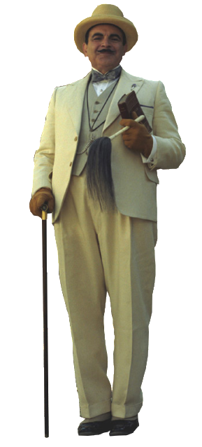
This project was inspired by the opening of the British TV series Poirot. I've always thought the graphics used were very dramatic and interesting, so, I decided to try to create a similar effect using GIMP.

Some of the things you will do in this project:
- Draw a path and make a selection from it
- Open an image as a new layer in the current image
- Scale a layer
- Use guides
- Apply a layer mask
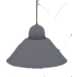
Download these source images before you begin: Poirot | OHVLamp
Create a new image 800 pixels tall by 600 pixels wide. Fill it with default black using the Bucket Fill Tool. Drag out vertical guides to 525, 310, 290, and 75 pixels. Pull down horizontal guides to 650 and 125 pixels.

Step 1. The light cone
Choose the Paths Tool. Draw a tall trapezoid with corners at 290, 125; 75, 675; 525, 675; and 290, 125. In the Tool Options, click on the Selection from Path button. Create a new transparent layer named Cone. Use the Bucket Fill Tool to fill the selection on the Cone layer with white. Then deselect, Select > None.

Step 2. The light fade
Add a white layer mask to the Cone layer, Layer > Mask > Add Layer Mask… . Using the Blend Tool, draw a black-to-white gradient up from the bottom of the trapezoid. You may have to experiment a few times to get the best effect. I went from 675 pixels up to 400 perpendicular to the base of the image.
i

Step 3. The oval of light on the floor
Choose the Ellipse Select Tool. Draw a white oval 450 pixels wide and 95 high. Make a new transparent layer, Oval. Fill the selection on this layer with white. Deselect. Use the Move Tool to center it over the lower horizontal guide.

Step 4. Hercule
Open the Poirot image as a new layer in the image, File > Open as Layers… . From the Layer menu, choose Scale Layer… , and scale it down to an appropriate size (I used 25%). Position this layer so that the feet are in the center of the light oval.

Step 5. Poirot's shadow
Add a new transparent layer, name it Shadow. With the Ellipse Select Tool, draw an oval around Poirot's feet. Fill it with black using the Bucket Fill Tool. Deselect. Select the Rotate Tool and turn it a little clockwise, about 5 degrees. You may need to adjust the position a bit with the Move Tool.

Apply a Gaussian blur with a Radius of of about 45, Filters > Blur > Gaussian Blur… . Drag the Shadow layer under the Poirot layer. Turn down the opacity to about 85%.

Step 6. The overhead lamp
Open the OHVlamp image as a new layer on top of all the other layers. Scale it down to an appropriate size (I used 30%). Position it over the top of the light cone.

Adjust the Brightness-Contrast from the Color menu, Brightness: -100, Contrast: 30.

Extension
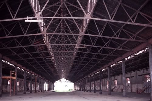
If you wish to continue, download this image: Industrial
http://i221.photobucket.com/albums/dd67/xmath_photos/GIMP%20Blog/Poirot%20Light/Industrial.jpg
Open the Industrial image as a new layer and drag it immediately above the Background layer in the Layers pallet. Scale the Industrial layer to fill the image above the lower horizontal guide.

Set the blending Mode to Lighten Only and slide the Opacity all the way down to 13.

From the View menu hide the guides. That’s it.

Wednesday, February 8, 2012
Clipping Masks
As you are likely aware, GIMP does not include a clipping mask function like some other image editors. A clipping mask allows a background image to show through holes in the masking layer and can be very useful. I looked around a little for a how-to on getting that kind of functionality in GiMP, but those I looked at didn't allow the background image that shows through to be repositioned after the mask was created. I think the ability to move the background is important to achieving just the right result, so I set out to figure out how this could be accomplished and discovered that it isn't at all difficult.

Some skills used in this project:
Text layer
Grids and guides
Layer effects
Selecting by color
merging layers
Open the image you want to show through and name that layer Background. Create a new transparent (must be transparent, not white) layer, White, and fill it with default white using the Bucket Fill Tool.
Click on the Text Tool to make a text layer. Use a heavy, bold font in default black. I used Futura Ultra Bold Condensed.

Select then merge the text layer down onto the White layer, Layer > Merge Down. Select the black text on the White layer with the Select by Color Tool.

Cut out the black text, Edit > Clear, then deselect. You may want to select the Background layer and move it around a little to get a better effect.

That's the basics of making a clipping mask in GIMP. With the Layer Effects plugin, you can get some dramatic looks. Get the plugin here if you don't have it yet.
I got this look by choosing the White layer and using the Outer Glow effect with the color set to black and everything else defaults.

Now, I'll show you how to use this technique to give the impression a picture has been cut into sections and each section placed on a raised panel.
Open the picture, add the transparent layer, and fill it with white as above.
Display the grid, View > Show Grid. From the rulers, I dragged out guides to divide the image in half both vertically and horizontally.

Next, using the Rectangle Select Tool in "Add to the current selection mode" and the gridlines, I selected four rectangles as shown.

Cut out the rectangles, Edit > Clear, and deselect. Hide the gridlines and the guides from the View menu. (You may at this point want to reposition your background picture a little bit.)

Add the shadow effect from the Script-Fu menu, Script-Fu > Layer Effects > Inner Shadow… . I bumped the size and offset both up to 8.0.

For a final touch, I used the Bucket Fill Tool to fill the White layer with the Wood pattern from the default Patterns pallet.